When it comes to linguistic analysis, I am a self-confessed statistics-phobe, and, for me, any instance in my research where complex statistical analysis and visualisation is required has always been the most challenging part of the process. I have solid foundational knowledge, thanks to an A-level in maths, but my confidence in whipping up pretty graphs and analysing complex datasets is low.
I have long been aware of the best solutions to my woes: one is to find the time to knuckle down and learn how to understand and use stats software like R. I know other researchers who have done just that and seem to be much more confident when complex statistical analysis is required. But I have always worried that the learning curve would be so steep that I may ‘waste’ too much time trying and failing to get things to work. Another solution is to work with someone who CAN do what you can’t do (and, ideally, offer them something in return!). But sometimes you just want to be able to sit and get on with something yourself.
This week, I was asked to cover a lecture for a colleague who had to go off work at short notice. It was an introductory lecture about quantitative research methods for language analysis. The lecture was ‘introductory’ enough that I felt perfectly comfortable with teaching the content. The only new aspect was a practical activity using a piece of software called JASP, which I had not heard of.
JASP is a free, open-source statistics tool supported by the University of Amsterdam. Their website boasts of “an intuitive interface that was designed with the user in mind”. Tasked with demonstrating how to use JASP with little time to prepare, I put this claim to the test.
I’m very happy to say that I found it very easy to use. What’s more, the support materials on their website are excellent, and offered in a range of formats including text, GIFs and YouTube videos. In addition, I found this guide for students which is super helpful.
Within not very much time, I found myself able to run analyses and produce plots that had previously given me a headache.
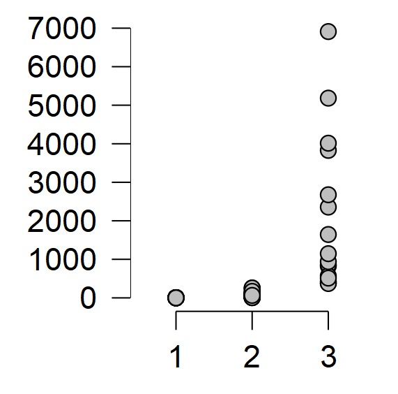
A correlation plot produced in JASP.
Plots like this may be fairly basic for some, but for me this is a massive first step in feeling more confident with calculating and presenting statistical analyses in my work. What’s more, with the recent release of corpus-specific resources like Lancaster stats tools online (and associated book by Dr Vaclav Brezina), I’m feeling more and more confident that moments like this will become more common!
